Israelite Nation
A UX/UI Case Study | Group Project | Desktop Viewport

Project Overview
Goal:
To understand users’ experiences with the website by identifying what they enjoy, what barriers they face, and any pain points that hinder their use. We aim to uncover the key tasks users visit the site for, explore opportunities to streamline the process, and pinpoint any confusing elements or areas for improvement.
Target audience:
The target audience consists of individuals aged 30 to 45 who are seeking to deepen their relationship with God.
Pre-assumptions:
-
People go to the website to find out more about the Israelite nation
-
People go to the website mainly for music
-
The eBook and the blogs are not big hits on the website
-
People go to the website to find out dates on Abib and Passover
-
People come to the website looking for facts/scriptures (did you know…)
-
For links to past youtube videos
-
To donate to us
-
Upcoming events
-
To find out about Elder Shadrock
Roles:
-
User Research
-
Information Architecture
-
UX/UI Collaborations
Tools:
-
Figma
-
Optimal workshop
-
Google Forms
DISCOVER
Competitor Research: Why We Did It
We analysed other church websites to gain insights into how they effectively maximise their online presence. Here are some key takeaways from our findings:
-
Lakewood: Visually engaging with clear service times, but confusing navigation and fast-moving icons that are hard to read.
-
BACC: Welcoming design with a good use of the logo, but feels targeted to younger people, and navigating between tabs gives the impression of entering different websites.
-
Potters: Effective use of visuals and clear directional cues, but lacks prominent conference information and uses a phrase that could be more contextually relevant.
This analysis suggests that INWWM can improve by enhancing visual engagement, ensuring intuitive navigation for a broad audience, and prominently displaying key information like events, while maintaining contextually relevant messaging.
User Research: Why It Mattered
We chose to move forward with conducting interviews with current users as well as individuals within the target audience.
Our goal: Uncover perception gaps—what users expected vs. what the platform delivered.
Key Takeaways:
-
Users want more accessible biblical content, including facts, podcasts, and a "What to Expect" section for newcomers, along with an up-to-date "What's Going On" page for service info, lesson schedules, and community updates.
-
Users are looking for more animations, smart images, and a vibrant, modern design. They want the site to reflect the community and culture of the nation, including details about Elder Shadrock and leadership.
-
Users feel the current site is too plain, with a distracting white background, and appears targeted to an older audience. They want the site to be more welcoming, community-focused, and easier to navigate.
-
Users mainly visit the site for general information about Israel and the nation, as well as to search for music. They do not engage with the ebooks or blogs, which are seen as outdated and not regularly updated.
DEFINE
After conducting user interviews, we analysed the data and developed a relevant persona—meet Nadine Richards.

Persona: Nadine
We created "Nadine" as someone who believes in God but is seeking the right path. She values being kept informed and in the loop. Nadine is a 39-year-old teacher who is working to improve her spiritual life alongside her three boys, with the ultimate goal of reaching paradise.
Problem Statement
“Nadine needs a better way to learn more about the INWWM because she wants her family to become more religious with her and she doesn’t like joining things in which she is not well informed of and wants something that her family can be engaged it"
“How Might We”
We asked: “HMW recreate the website to ensure that user learn more, know what to expect and get an insight to our youth, culture and community in a diverse way?”
DEFINE
Sketching
A few of us came together to create some sketches illustrating how we envision the homepage—both from our perspective and how we believe Nadine would like it to look in order to make it as accessible as possible. Here are the sketches:

Grey Scale WireFrames
After completing our sketches, we regrouped and realised that we might be overcrowding the homepage. We were concerned that too much content could be distracting or lead to frequent misclicks. To avoid this, we decided to keep the homepage as simple and focused as possible to better engage visitors by adding a "New Here?" cta and encourage them to stay on the site. As a result, we created a clean, grayscale wireframe.

With our initial designs complete, we began considering the colour palette. Fortunately, the Israelite Nation has its own flag and established colours. We were advised to stick to the flag’s colour scheme—not necessarily using every colour, but drawing inspiration from it. We can introduce additional colours if needed, as long as they don't stray too far from the overall aesthetic. The colours that they gave us were blue, white, gold, red and purple.

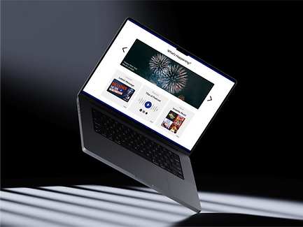
DELIVER
Wireframes & Prototype
We developed low- and mid-fidelity wireframes to validate the layout and content hierarchy before progressing to high-fidelity mockups. Our design approach was intentionally crafted to be:
-
Concise – respecting the user's time
-
Visually clear – minimizing distractions
-
Goal-driven – guiding users toward relevant course recommendations


Next Steps
Our next step is to conduct usability testing, as we haven’t yet been able to recruit participants. Once testing is complete, we’ll make the necessary iterations to the prototype. The goal is to launch a fully functional and easily accessible website.
Thank you for your time and patience in reading this case study—we truly appreciate it.